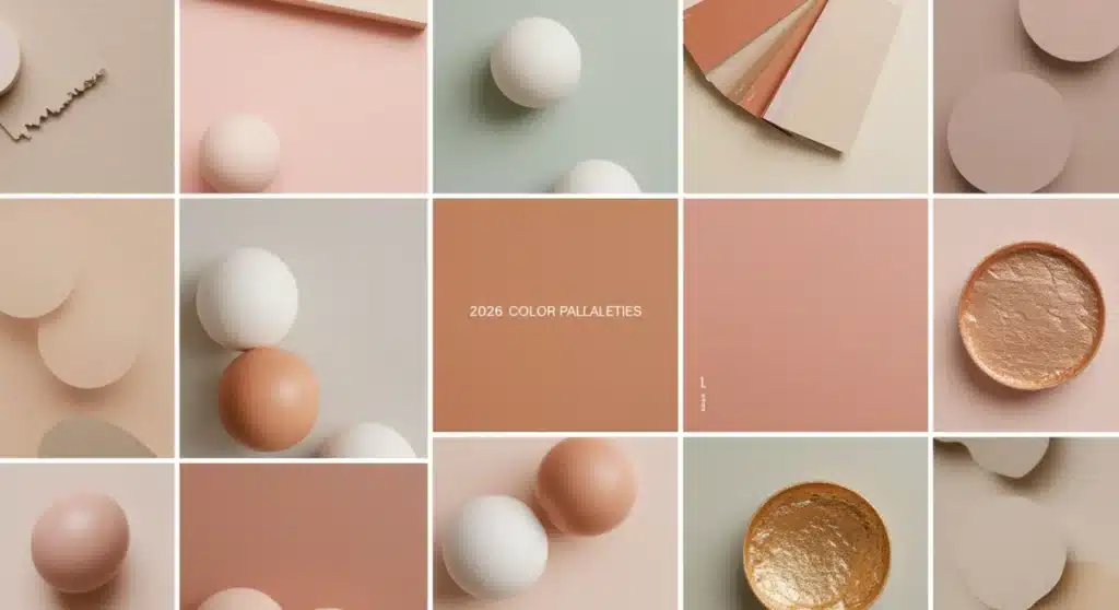
Decoding 2026 Color Palettes: Insider Knowledge to Elevate Your Personal Style
Color is more than just a visual element; it’s a powerful language that influences our emotions, perceptions, and even our purchasing decisions. Every year, designers, trend forecasters, and industry experts meticulously analyze global shifts, cultural movements, and technological advancements to predict the color palettes that will dominate the coming seasons. As we look towards 2026, understanding these emerging 2026 color palettes isn’t just for fashionistas or interior decorators; it’s for anyone looking to stay ahead of the curve, express themselves authentically, and create environments that resonate with contemporary sensibilities. This comprehensive guide will delve deep into the anticipated 2026 color palettes, offering insider knowledge to help you decode their meanings, apply them effectively, and elevate your personal style and living spaces.
The Foundation of Color Forecasting: Why Do Colors Change?
Before we dive into the specifics of the 2026 color palettes, it’s crucial to understand the fascinating process behind color forecasting. Color trends don’t just appear out of nowhere; they are the result of extensive research and analysis by leading institutions like Pantone, WGSN, and various design agencies. These organizations study a myriad of factors:
- Socio-Political Climate: Global events, political landscapes, and societal moods often manifest in color preferences. For instance, times of uncertainty might lead to a demand for comforting, grounding tones, while periods of optimism could usher in brighter, more vibrant hues.
- Technological Advancements: New materials, digital innovations, and even the rise of virtual realities can influence color trends. Think about how screen-based aesthetics have popularized certain glowing or muted tones.
- Cultural Shifts: Art, music, fashion, and even culinary trends from different cultures contribute significantly. As the world becomes more interconnected, diverse influences are increasingly reflected in global color palettes.
- Environmental Concerns: A growing awareness of sustainability and nature often translates into an appreciation for earthy, organic, and eco-conscious color schemes.
- Historical Cycles: Fashion and design are cyclical. Elements from past decades are often reinterpreted with a modern twist, bringing back certain color families in new contexts.
By synthesizing these complex factors, forecasters identify overarching themes and sentiments that then translate into specific 2026 color palettes. These palettes are not just random collections of colors; they tell a story about where we are as a society and where we are headed.
Emerging Themes Shaping the 2026 Color Palettes
While definitive declarations are still some time away, early indicators and ongoing analyses point to several key themes that will profoundly influence the 2026 color palettes. These themes reflect a world in flux, seeking balance between innovation and introspection, connection and individuality.
1. Digital Serenity: The Blurring Lines of Reality
As our lives become increasingly intertwined with digital spaces, there’s a growing desire for colors that evoke a sense of calm and escape, yet still acknowledge the digital realm. The 2026 color palettes are expected to feature ethereal, almost pixelated pastels and futuristic metallics. Think soft lavenders, digital blues, muted mints, and shimmering silvers or iridescent finishes. These colors suggest a blend of the physical and virtual, offering a tranquil yet forward-thinking aesthetic. They are often desaturated, carrying a gentle glow reminiscent of screen light, promoting a sense of digital well-being rather than overwhelming stimulation.
2. Earth’s Embrace: Rooted in Nature
The enduring connection to nature continues to be a dominant force. However, the 2026 color palettes will see a more refined and sophisticated interpretation of earthy tones. Beyond traditional greens and browns, expect to see deeper, richer soil tones, sun-baked terracottas, muted desert roses, and oceanic blues with an undertone of mossy greens. These colors speak to sustainability, authenticity, and a desire to reconnect with the natural world, fostering a sense of grounding and stability. They are comforting, organic, and often textured, inviting tactile experiences.
3. Joyful Optimism: A Resurgence of Vibrancy
After periods of global introspection, there’s a palpable yearning for joy and positivity. The 2026 color palettes will likely feature bursts of optimistic hues, but with a nuanced twist. Instead of primary brights, anticipate sophisticated, saturated shades that feel uplifting without being childish. Think vibrant coral, warm saffron, electric but elegant fuchsia, and energetic turquoise. These colors are about celebrating life, creativity, and personal expression. They are often paired with more neutral or grounding tones to create a balanced yet impactful statement.
4. Heritage & Craft: Honoring the Past
A renewed appreciation for craftsmanship, tradition, and cultural heritage will also play a role. This theme will bring forth 2026 color palettes inspired by artisanal dyes, historical textiles, and global art forms. Expect rich, deep jewel tones like emerald green, sapphire blue, ruby red, and amethyst purple, often combined with warm, aged neutrals. These colors tell stories, evoke a sense of history, and celebrate the beauty of handmade imperfection. They are luxurious and timeless, suggesting a move away from fast fashion and disposable aesthetics.
Key Colors to Watch in 2026
While specific ‘Colors of the Year’ are announced closer to the time, based on the overarching themes, we can anticipate certain color families and individual shades to be particularly prominent within the 2026 color palettes:
- Muted Sage Green: A sophisticated, calming green that bridges nature and minimalist design. It’s versatile and pairs well with both warm and cool tones, embodying the ‘Earth’s Embrace’ theme.
- Digital Lavender: An ethereal, almost glowing pastel purple that captures the ‘Digital Serenity’ theme. It’s calming, futuristic, and has a soft, dreamy quality.
- Warm Terracotta: A sun-baked, earthy orange-brown that brings warmth and authenticity. It’s a key player in the natural and heritage-inspired 2026 color palettes.
- Deep Ocean Blue: A rich, profound blue with hints of green, reflecting depth, tranquility, and environmental consciousness. It’s a grounding color that can feel both luxurious and natural.
- Vibrant Saffron: A spicy, energetic yellow-orange that injects optimism and cultural richness. It’s a bold yet sophisticated choice that aligns with ‘Joyful Optimism’ and ‘Heritage & Craft’.
- Soft Pearl Grey: A refined, almost iridescent grey that offers a neutral base with a hint of futuristic sheen. It’s perfect for creating sophisticated, minimalist backdrops within the 2026 color palettes.
- Rose Quartz Pink: A gentle, comforting pink that speaks to softness, self-care, and a return to subtle beauty. It’s a perennial favorite that will likely continue its subtle presence.
Integrating 2026 Color Palettes into Your Personal Style
Now that we’ve explored the anticipated 2026 color palettes, how can you effectively integrate them into your wardrobe and personal aesthetic? It’s not about a complete overhaul, but rather strategic additions and thoughtful combinations.
1. Start with Neutrals and Accents
If you’re hesitant to embrace bold new colors, begin by introducing them as accents. A scarf in Digital Lavender, a handbag in Warm Terracotta, or a statement necklace featuring Deep Ocean Blue can instantly update your look. Pair these with your existing neutral wardrobe (creams, blacks, greys, navies) to create a sophisticated and current ensemble. This approach allows you to experiment with the 2026 color palettes without feeling overwhelmed.
2. Monochromatic Magic with a Twist
Monochromatic dressing is always chic, and applying it to the 2026 color palettes can be incredibly powerful. Choose one of the key colors, like Muted Sage Green, and build an outfit using different shades and textures of that color. For example, a sage green silk blouse, a darker olive green skirt, and a light mint green jacket. This creates depth and visual interest while highlighting the chosen hue from the 2026 color palettes.
3. Complementary Combos
Explore how the new 2026 color palettes can complement each other. For instance, the calming effect of Muted Sage Green can be beautifully juxtaposed with a pop of Vibrant Saffron. Or, the digital cool of Lavender can be warmed up with a touch of Terracotta. Understanding basic color theory (complementary, analogous, triadic) can help you create harmonious and exciting combinations that truly stand out.
4. Texture and Fabric Play
Color is amplified by texture. A Deep Ocean Blue in velvet will have a different impact than the same shade in linen or silk. Look for pieces in the 2026 color palettes that feature interesting textures – chunky knits, flowing satins, structured wools, or delicate lace – to add another dimension to your outfits. This adds richness and sophistication, making your color choices even more impactful.
5. Capsule Wardrobe Integration
For those building a capsule wardrobe, select 2-3 key colors from the 2026 color palettes that truly resonate with your personal aesthetic and can be easily mixed and matched with your core pieces. This ensures versatility and longevity, allowing you to stay current without constantly buying new items. Consider how these new colors can refresh existing staples.
Transforming Your Home with 2026 Color Palettes
Your living space is an extension of your personal style, and incorporating the 2026 color palettes can breathe new life into your home, creating an environment that feels fresh, modern, and aligned with current trends. The psychological impact of color is particularly potent in home decor, influencing mood, energy, and comfort.
1. The Power of Paint
Painting an accent wall is the most dramatic way to introduce a new color. Consider a wall in Muted Sage Green for a calming bedroom, or a Digital Lavender in a creative studio space. For a more subtle approach, paint a piece of furniture, like a dresser or a bookshelf, in one of the vibrant 2026 color palettes to create a focal point. Remember that lighting plays a huge role in how colors appear, so always test swatches in your space before committing.
2. Soft Furnishings and Textiles
Cushions, throws, rugs, and curtains are excellent ways to layer in the 2026 color palettes. A Deep Ocean Blue rug can ground a living room, while throw pillows in Warm Terracotta and Vibrant Saffron can add pops of color and texture. These elements are relatively inexpensive to change, allowing you to update your space seasonally or as new trends emerge. Look for natural fibers like linen, cotton, and wool that align with the ‘Earth’s Embrace’ theme.
3. Art and Decor Accents
Artwork, vases, sculptures, and decorative objects offer another avenue for introducing the 2026 color palettes. A piece of abstract art featuring Digital Lavender and Soft Pearl Grey can set a modern tone. Ceramic vases in Warm Terracotta or glass bowls in Deep Ocean Blue can add subtle yet impactful touches. Even books with spines in trending colors can contribute to the overall aesthetic.
4. Furniture Choices
If you’re investing in new furniture, consider pieces upholstered in the anticipated 2026 color palettes. A sofa in a sophisticated Muted Sage Green or an armchair in a rich Deep Ocean Blue can be a long-lasting statement. For smaller investments, dining chairs or ottomans in a trending hue can provide a contemporary update. Remember to balance bolder furniture pieces with more neutral surroundings to avoid overwhelming the space.
5. Creating Harmony and Flow
When incorporating multiple colors from the 2026 color palettes, ensure there’s a sense of harmony and flow throughout your home. You don’t need every room to be the same, but there should be a common thread. Perhaps a consistent neutral base color, or a recurring accent color that appears in different intensities in various rooms. This creates a cohesive and well-designed feel, making your home feel intentionally curated.
The Psychology Behind the 2026 Color Palettes
Understanding the psychological impact of colors is key to making informed choices, whether for your wardrobe or your home. The 2026 color palettes are designed to evoke specific feelings and responses:
- Muted Sage Green: Represents growth, tranquility, and balance. It’s a calming color that can reduce stress and promote well-being. Ideal for bedrooms, bathrooms, or meditation spaces.
- Digital Lavender: Evokes serenity, introspection, and a touch of fantasy. It’s soothing and imaginative, perfect for creative spaces or areas where relaxation is desired.
- Warm Terracotta: Symbolizes warmth, grounding, and connection to nature. It can make a space feel cozy, inviting, and authentic. Excellent for living rooms, kitchens, or dining areas.
- Deep Ocean Blue: Projects stability, depth, and intelligence. It can be both calming and regal, promoting focus and a sense of peace. Suitable for studies, offices, or master bedrooms.
- Vibrant Saffron: Radiates energy, optimism, and creativity. It’s a stimulating color that can uplift spirits and encourage conversation. Best used as an accent in social areas like living rooms or dining rooms.
- Soft Pearl Grey: Conveys sophistication, modernity, and neutrality. It’s a versatile base that allows other colors to shine, creating a sense of calm and order. Works well in virtually any room.
- Rose Quartz Pink: Suggests tenderness, compassion, and nurturing. It’s a gentle color that can soften a space and create a welcoming atmosphere. Ideal for nurseries, bedrooms, or cozy nooks.
By considering these psychological associations, you can strategically use the 2026 color palettes to create desired moods and atmospheres in your personal spaces and express specific facets of your personality through your style choices.
Beyond Trends: Developing Your Signature Color Story
While understanding and appreciating the 2026 color palettes is valuable, true style lies in developing your own signature color story. Trends come and go, but your personal connection to color can be timeless. Here’s how to cultivate it:
1. Listen to Your Intuition
What colors genuinely make you feel good? What hues do you gravitate towards naturally? Your innate preferences are the most reliable guide. If a particular color from the 2026 color palettes doesn’t resonate with you, don’t force it. Personal style is about self-expression, not rigid adherence to trends.
2. Consider Your Complexion and Hair Color
Certain colors will naturally enhance your skin tone, hair color, and eye color. Understanding whether you have warm or cool undertones can help you select shades from the 2026 color palettes that flatter you most. For example, individuals with warm undertones might shine in Terracotta or Saffron, while those with cool undertones might prefer Digital Lavender or Deep Ocean Blue.
3. Build a Cohesive Wardrobe and Home
As you integrate new colors, think about how they interact with what you already own. A well-curated wardrobe and home have a consistent underlying theme, even if they incorporate diverse elements. The 2026 color palettes offer a fantastic opportunity to refine this cohesion, ensuring every new addition feels intentional and harmonious.
4. Experiment and Evolve
Style is a journey, not a destination. Don’t be afraid to experiment with the 2026 color palettes. Try new combinations, mix unexpected textures, and see what works for you. Your preferences might evolve over time, and that’s part of the fun. The goal is to feel confident and comfortable in your choices.
5. Capsule Wardrobe Integration
For those building a capsule wardrobe, select 2-3 key colors from the 2026 color palettes that truly resonate with your personal aesthetic and can be easily mixed and matched with your core pieces. This ensures versatility and longevity, allowing you to stay current without constantly buying new items. Consider how these new colors can refresh existing staples.
Conclusion: Embracing the Future with 2026 Color Palettes
The 2026 color palettes are poised to usher in a period of thoughtful design, blending digital innovation with a deep reverence for nature and heritage, all while embracing a renewed sense of optimism. From the soothing calm of Muted Sage Green and Digital Lavender to the vibrant energy of Saffron and the grounding presence of Deep Ocean Blue, these colors offer a rich tapestry for self-expression and environmental curation.
By understanding the underlying themes and psychological impacts of these colors, you are empowered to make intentional choices that not only keep you current but also enhance your well-being and reflect your unique personality. Whether you’re refreshing your wardrobe, updating your living space, or simply seeking inspiration, the 2026 color palettes provide a captivating framework for elevating your personal style. Embrace these emerging trends, but always remember to filter them through the lens of your own authentic taste, creating a style that is truly and beautifully yours.


