mixing prints and patterns stylishly: elevate your wardrobe
Mixing prints and patterns stylishly means choosing one dominant print, echoing a shared color, pairing large and small scales, balancing textures and fit, and anchoring with neutrals or solids to create cohesive, confident outfits you can repeat.
mixing prints and patterns stylishly can feel risky — but with a few simple rules you get bold, wearable looks. Want quick formulas and real examples to try today?
Understanding prints: scale, color and contrast
mixing prints and patterns stylishly starts with small, clear choices about scale, color and contrast. Simple swaps can change a look from messy to polished.
Focus on how big or small a print reads, which colors tie pieces together, and how contrast sets the mood of an outfit.
Scale matters: big vs. small
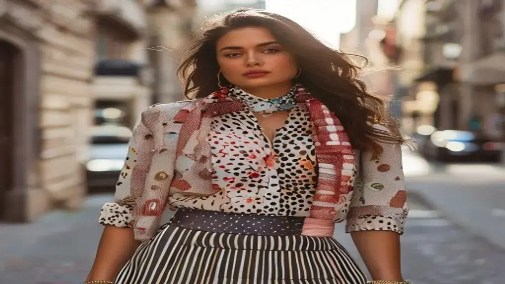
Large prints read bold and draw the eye. Small repeats feel subtle and textural. Mixing one large print with one small print keeps the outfit balanced.
- Pair a dominant large motif with a small, simple repeat to avoid visual conflict.
- Use a solid or neutral piece to anchor the mix and give the eye a rest.
- Let the larger print sit on the part of the body you want to emphasize.
Color and contrast: balance hues
Color links prints. Choose a shared hue or a neutral to unify patterns. Contrast controls drama: high contrast pops, low contrast blends.
- Pick one color that appears in both prints to create cohesion.
- For bold impact, use high contrast like black and white or opposite colors on the wheel.
- For a softer look, match tones and use low contrast between prints.
Textures and fabric weight also affect how prints read. A satin floral will feel dressier than a cotton stripe. Mix textures to add depth without adding noise.
Think about proportion: if you wear a loud print on top, choose a calmer print below. Accessories can echo a color or scale to make the outfit feel intentional.
Try quick formulas to practice: a large floral blouse + small striped skirt + neutral coat; polka-dot scarf + tonal checked blazer + solid trousers. These recipes make mixing prints and patterns stylishly easier to master.
With a few simple rules—one dominant print, a shared color, and mindful contrast—you can mix prints with confidence and create looks that feel cohesive and fresh.
Choosing a dominant piece and complementary prints
mixing prints and patterns stylishly often begins with one standout item. Choose that dominant piece first, then add smaller, supportive patterns that echo its tones.
When one item leads, the rest feels intentional instead of chaotic.
Choose a clear focal piece
Pick the item that will catch the eye: a bold coat, a large floral dress, or a striking blazer. That piece sets the outfit’s style and scale.
Match through color and scale
Let smaller prints pick up a color from the dominant piece. Keep one print large and the others smaller to avoid visual fighting.
- Use one repeated color across pieces to create cohesion.
- Pair a large motif with subtle, small-scale repeats.
- Anchor the look with a solid or neutral item to give the eye a rest.
Fabric weight matters: a heavy wool coat will read heavier than a light cotton dress. Balance weight so the dominant piece doesn’t overwhelm the supporting prints.
Think about placement. Wear the dominant print where you want attention—top, skirt, or outer layer—and use quieter prints on other zones to guide the eye.
Use accessories to tie prints together
Accessories can echo a color or a small motif. A scarf, belt, or bag that repeats a hue makes mixed prints read as one coordinated outfit.
- Choose shoes in a neutral or a shared color from the prints.
- Let jewelry be subtle when prints are loud.
- Use a bag or scarf to repeat a key accent color.
Try simple formulas to practice: statement blazer + tonal patterned tee + subtle print skirt, or bold floral dress + small geometric scarf + neutral coat. These combos help you learn balance without stress.
With a strong focal piece, shared colors, and mindful scale, mixing prints and patterns stylishly becomes easier and more confident.
Mixing patterns by scale and color harmony

mixing prints and patterns stylishly works when you think about size and color like tools. Small changes in scale or hue make outfits look calm and smart.
Start by spotting which print should lead and which should support. That choice guides every other pick.
Start with clear scale rules
Use one large pattern and at least one small repeat. The big print reads as the statement. The small print acts like a soft background.
Anchor with solids and tone
A plain piece gives your eyes a break and makes patterns pop in the right places. Neutrals help prints breathe without stealing focus.
- Keep one piece dominant, the rest subtle.
- Use a solid color that appears in the prints as an anchor.
- Match scale to body area: large prints work well on skirts or coats; small prints suit shirts and scarves.
Color harmony ties prints together. Choose one shared color to repeat across items, or pick tones in the same family for a soft look. Bright accents can add flair, but use them sparingly.
Think in groups: warm palettes (reds, ochres, browns) read cozy. Cool palettes (blues, greens, grays) feel calm. Mixing warm and cool can work if you pick one connecting color.
Contrast choices: bold or subtle
High contrast gives energy; low contrast smooths the mix. Decide the mood first, then match contrast to that goal.
- High contrast: black-and-white or opposite hues for drama.
- Low contrast: same-tone prints for a quiet, modern look.
- Mid contrast: add one bright accessory to lift a toned-down mix.
Fabrics change how patterns behave. Shiny fabrics reflect light and make patterns feel louder. Matte fabrics mute prints. Mix textures to add depth without adding noise.
Practice quick combos: muted plaid jacket + light floral blouse + denim; small geometric top + wide-stripe skirt + neutral boots. Swap one item at a time to learn what each change does.
With clear scale choices, a repeated color, and the right contrast, mixing prints and patterns stylishly becomes a repeatable skill you can use every week.
Textures, fabrics and practical outfit formulas
mixing prints and patterns stylishly relies on fabric and texture as much as on pattern. The right materials can calm a busy print or make it sing.
Focus on how a fabric feels, its weight and its sheen. These traits change how a print reads on the body.
How fabrics change a print
Satin and silk make prints look fluid and dressy. Cotton and linen feel casual and crisp. Knit fabrics add softness and tone down sharp patterns.
Balance shine and matte
Shiny fabrics exaggerate color and contrast. Matte fabrics mute brightness and help prints blend.
- Pair a glossy top with a matte bottom to control visual intensity.
- Use textured neutrals (wool, tweed) to anchor loud prints.
- Match fabric weight so one piece doesn’t overpower the rest.
Practical outfit formulas help you practice without guessing. Try a heavy textured coat over a light floral dress. Or pair a silk blouse with a cotton skirt and a knit scarf to mix feels without chaos.
Simple tested combos speed learning. Think: statement coat + tonal patterned top + neutral bottoms; bold print dress + subtle printed scarf + solid shoes; small-printed blouse + wide-stripe skirt + neutral blazer. These formulas show how texture tames scale and color.
Season and care matter
Choose fabrics by season: linen and cotton for heat, wool and velvet for cold. Care needs also affect wearability—some silks need delicate washing, while cotton is easy to clean.
- Rotate heavy and light fabrics by season to keep balance.
- Pick washable items for everyday mixed-print looks.
- Use layering to combine different weights without bulk.
With clear formulas, matched weights, and a mix of matte and shine, mixing prints and patterns stylishly becomes simple to try and easy to repeat.
Tips for confident wear: fit, accessories and balance
mixing prints and patterns stylishly feels easier when fit, accessories and balance work together. A good fit makes prints read polished instead of messy.
Small choices—tailoring, a belt, the right shoes—can change how bold patterns look on you.
Prioritize fit first
Tailoring is simple and powerful. Hem lengths, sleeve fit and waist shape change how prints sit on the body.
Choose a size that follows your shape without adding bulk. If a piece is very loose, add structure with a belt or a fitted layer.
Use accessories to connect prints
Accessories can echo a color or a scale and make mixes feel planned. Scarves, belts and shoes are quick fixes that tie pieces together.
- Pick one accessory that repeats a color from your dominant print.
- Use a belt to define the waist and break large patterns.
- Choose neutral shoes when prints are busy to ground the look.
- Match accessory scale to outfit scale: small prints suit delicate jewelry; large prints pair with chunkier pieces.
Balance by letting one item lead. If a coat or dress is loud, keep layers beneath calmer and more fitted. This guides the eye and avoids pattern conflict.
Layering helps control contrast. A solid blazer or knit over a printed top gives the eye a rest and sharpens the silhouette. Use texture to add interest without extra prints.
Mind proportion and placement
Place the loudest print where you want attention. Large prints near the face draw focus; smaller prints can sit lower on the body.
- Large print top + small print bottom keeps balance.
- Printed scarf + solid jacket creates a focal point near the face.
- If both pieces are bold, use a neutral mid-layer to separate them.
Practice with simple swaps: change shoes, add a belt, or swap a scarf. Each tweak teaches what works for your shape and style.
When fit, thoughtful accessories and clear balance come together, mixing prints and patterns stylishly becomes a confident choice you can repeat.
FAQ – Mixing prints and patterns stylishly
How do I start mixing prints if I’m a beginner?
Begin with one dominant print and add a smaller, subtler print. Anchor the look with a solid item to keep it simple.
What is the easiest way to make prints look cohesive?
Repeat a shared color across pieces or use a neutral as an anchor. A tying color makes different prints read as one outfit.
How can I avoid prints clashing on my body shape?
Match print scale to body areas: larger prints on skirts or coats, smaller prints near the face. Use fit and a belt to control proportion.
Which accessories work best when mixing patterns?
Choose accessories that echo a color or repeat a small motif. Neutral shoes and a simple belt or scarf can ground busy prints.


