Style Guide Hack: Mix Prints Like a Pro & Avoid Faux Pas
Mixing prints can be a fun way to express your style, but it can also be tricky; this style guide hack provides the tools and knowledge to mix and match prints confidently, ensuring you avoid common fashion faux pas and create stylish, eye-catching outfits.
Do you love prints but struggle to combine them? This style guide hack: how to mix and match prints like a pro (and avoid fashion faux pas) will take you from print-clashing disaster to pattern-mixing master.
Understanding the Basics of Print Mixing
Print mixing might seem intimidating, but understanding basic principles makes it easier. It’s about creating a cohesive and visually appealing look, not just throwing random patterns together.
Why Mix Prints?
Mixing prints allows you to inject personality into your wardrobe and create unique outfits that stand out. It’s a creative way to elevate your style.
- Personal Expression: Show off your unique style.
- Elevated Style: Create more interesting looks.
- Wardrobe Versatility: Get more mileage out of your clothing.
Mixing prints adds depth and dimension to your outfits, making them more visually engaging and fashion-forward. By mastering the art of print mixing, you can transform simple garments into statement pieces.
Choosing Your Base Print
Selecting your base print is the foundation of a successful mixed-print outfit. This print sets the tone and guides your other choices.
What Makes a Good Base Print?
A good base print is versatile and has a color palette that can be easily matched with other prints. Consider these factors when selecting your base print:
- Versatility: Choose a print that pairs well with many colors.
- Color Palette: Select a print with colors you love and wear often.
- Scale: Opt for a medium-sized print for easy pairing.
A medium-sized print often works best as a base print because it’s not too overwhelming and provides enough visual interest without dominating the entire outfit. Think of a classic floral print or a medium-width stripe.
Coordinating Colors and Scales
Color and scale are crucial elements in successful print mixing. Harmonizing colors and varying the scale of your prints creates a balanced and visually appealing look.
How to Coordinate Colors
Choose prints that share at least one common color. This helps tie the outfit together and creates a cohesive look.
Using complementary colors or analogous colors can also be effective. Complementary colors are opposite each other on the color wheel (e.g., blue and orange), while analogous colors are next to each other (e.g., blue, blue-green, and green).
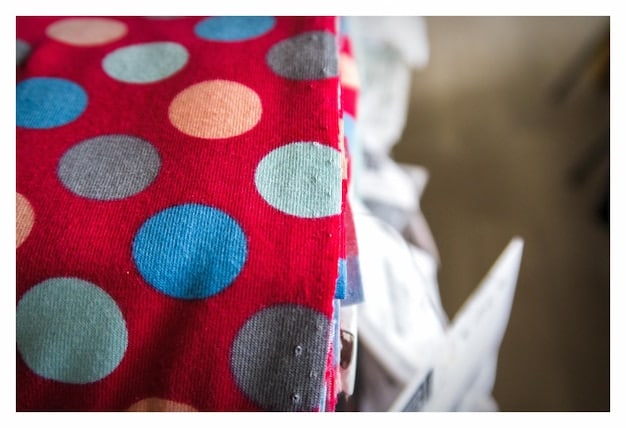
Mixing Print Scales
Varying the scales of your prints adds visual interest and prevents the outfit from looking too busy.
- Large and Small: Pair a large-scale print with a smaller one.
- Proportion: Ensure the scales are significantly different to create contrast.
For example, you could pair a large floral print with a small polka dot print. This creates a dynamic and balanced look.
Common Print Combinations That Work
Certain print combinations are classic and easy to pull off. Knowing these combinations can help you build confidence in your print-mixing skills.
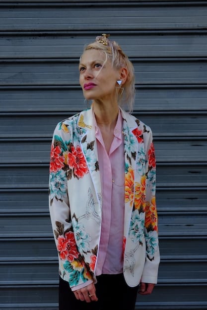
Stripes and Florals
Stripes and florals are a versatile combination. Choose stripes in neutral colors and florals with similar tones to create a harmonious look.
The contrast between the structured stripes and the organic florals creates a visually appealing balance. This combination works well for both casual and dressy outfits.
Polka Dots and Animal Prints
Polka dots and animal prints can create a playful yet sophisticated look. Keep the colors consistent to avoid clashing.
- Classic Combo: Timeless and easy to style.
- Color Harmony: Choose prints with similar color palettes.
For instance, pair black polka dots with a black and white zebra print. This combination is fun and stylish without being overwhelming.
Breaking the Rules and Experimenting
Once you’ve mastered the basics, don’t be afraid to break the rules and experiment. Fashion is about expressing yourself, so have fun with your print combinations.
Don’t Be Afraid to Clash
Sometimes, intentionally clashing prints can create a unique and edgy look. The key is to do it with confidence.
Breaking the rules can lead to unexpected and stylish results. Embrace your creativity and don’t be afraid to try new things.
Accessorize Wisely
When mixing prints, keep your accessories simple and neutral. This ensures that your outfit is the focus.
Neutral-colored shoes, bags, and jewelry won’t compete with your prints and will help balance the overall look. Consider understated pieces that complement rather than overshadow your outfit.
Avoiding Common Fashion Faux Pas
While print mixing can be fun, it’s essential to avoid common mistakes that can lead to fashion faux pas. Here are some tips to keep in mind:
Too Many Prints
Stick to two or three prints per outfit. Too many prints can be overwhelming and make your outfit look chaotic.
Edit your outfit and remove any unnecessary prints. Simplicity often leads to a more polished and stylish look.
Mismatched Colors
Avoid prints with clashing colors. Ensure that your prints share at least one common color or use complementary colors for a cohesive look.
Color harmony is key to successful print mixing. Pay attention to the color palettes of your prints and choose combinations that work well together.
| Key Point | Brief Description |
|---|---|
| 🎨 Base Print | Choose versatile, medium-scale prints. |
| 🌈 Color Harmony | Match colors for a cohesive look. |
| ⚖️ Scale Variation | Mix large and small prints for balance. |
| ✨ Accessorizing | Keep accessories simple and neutral. |
FAQ
▼
Yes, but consider the scale and color. For example, a large, bold floral can pair with a smaller, more delicate floral print if they share a common color theme.
▼
Start with classic combinations like stripes and florals. Once you feel comfortable, experiment with bolder combinations like polka dots and animal prints.
▼
Incorporate subtle prints in neutral tones. A pinstripe blazer with a muted floral blouse works well in professional settings, keeping it classy and appropriate.
▼
Use a neutral color to tie the outfit together. A black belt, white shirt, or denim jacket can help blend prints that don’t share colors directly.
▼
Yes, stripes, especially classic black and white stripes, are incredibly versatile. They pair well with almost any print and act as a neutral base.
Conclusion
Mastering the art of mixing prints can elevate your style and allow for endless creative expression. By following these guidelines, you can confidently experiment with different patterns, create unique outfits, and avoid common fashion faux pas, turning everyday looks into fashion statements.


